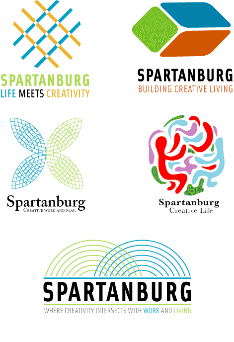
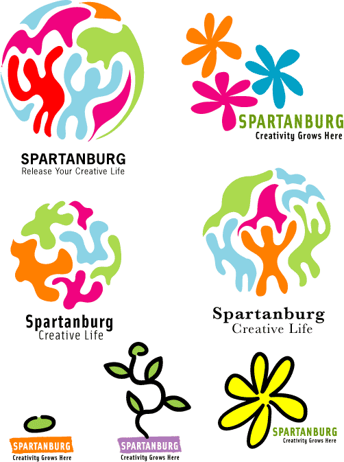
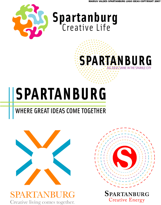
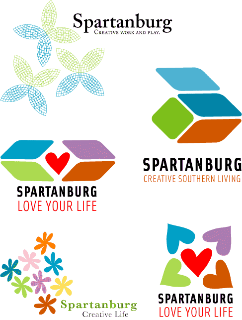
SO I HAVE TURNED OFF THE PAINTING SIDE OF MY BRAIN AND NOW I AM DOING SOME IDENTITY WORK WHICH WAS ALOT OF FUN. I REALLY HAD NO IDEAS STARTING ON THIS BUT GOT INTO A GOOD LATE NIGHT GROOVE AND OUT CAME A BUNCH OF THESE IDEAS. THE CITY OF SPARTANBURG IS HAVING A LOGO DESIGN CONTEST TO CREATE AN IDENTITY FOR THE NEXT 18 MONTHS WHILE SPARTANBURG WORKS ON A PLAN OF REDEFINIG WHAT THE CITY IS ALL ABOUT. THE MAIN CONCEPT EMPHASIZED WAS THAT THE IDENTITY REFLECT CREATIVITY OF THE PEOPLE, PLACES, WORK, AND ATMOSPHERE OF SPARTANBURG. I DON'T KNOW IF I CAPTURED THAT BUT I HAVE SORT OF A GOOD JUSTIFICATION FOR EACH LOGO PRESENTED AND I DO HAVE A FAVORITE BUT I WON'T SAY WHAT IT IS.
3 comments:
Marius-
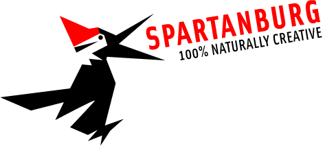
I like the ones that have a threading or fabric concept, very cool. Although I don't know in a B&W rendition. I like the crow, although don't understand that one. It is very bold. The amoebic people are interesting as well. As a whole though you were on a roll with getting those designs out. Bridget
Marius,
I think that the open box logos (green-orange-blue sides) are bolder, clearer. I like the potential of pairing it up with another image/logo ... like Spartanburg Presents... Overall good process. Therese
Marius,
What was the outcome of this project? I'm curious.
Susan
Post a Comment